
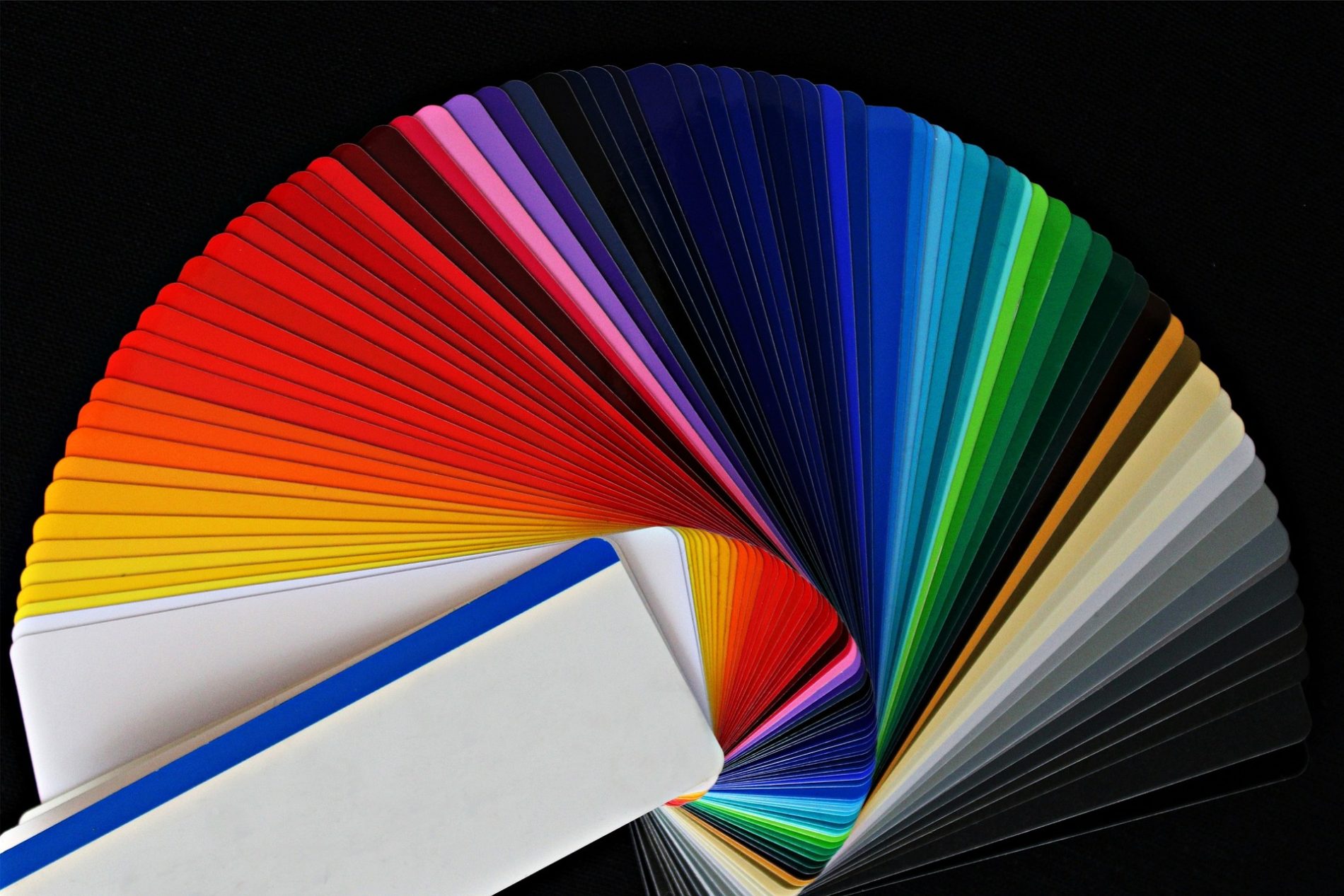
In design, colours are often used to create certain atmospheres and feelings in relation to products and services, even though we might not realise it. When it comes to healthcare, research has shown that certain colours can have different effects on patients, visitors and staff members alike, depending on the colour itself as well as its surroundings and combination with other colours. This means that not only the aesthetics of a dental clinic should be taken into consideration but also the impact of its colour scheme, which can have positive or negative effects on the health of patients and their relatives.
The right colours can have a huge impact on people’s feelings and emotions. As designers, it’s our work to consider how colours can improve the dental care experience. In fact, studies show that using certain colours can help patients feel better.
Hospitals and clinics often use bright, primary colours to provide a welcoming atmosphere for their patients. Primary colours (like red, blue, yellow) encourage us to feel more optimistic and can bring about greater energy and attention. In comparison, secondary colours (like green, orange, purple) are softer and not as intense; they’re often used in waiting rooms or examination rooms where a patient needs to feel calm or at ease.
To ensure that colours in each project are chosen correctly we look at the overall branding, and consider interiors, signage as well as the customer experience within the dental clinics, the importance of all of these factors combine to provide a cohesive branding, that will work across all business requirements.

Recent branding across Cotteswold Dental Care presents complementary colours, as well as modernising the brand. The use of the muted stone colour within the Cotteswold branding, represents a calming interaction with the patients, whilst the contrasting blue, reflects the professionalism and knowledge within the practice. We used the ‘Smile’ in coral across the branding for Cotteswold Dental Care, to reflect the practice’s value of the customer experience, that would follow the patient’s journey through their treatment.


Colour palette concepts, for Cowbridge Orthodontic Clinic, the colours present a calming effect, as well as showing a link to a lifestyle and experience that customers could have through their smile transformation. The muted pastel of the pink and brown, reflect the customer lifestyle transformation, reflecting a sense of energy, care and calmness. The use of the blues, reflect professionalism, trust as well as authority within their practice.